
Tuesday, January 14, 2014
Postcard Art - Mario Ortiz "Never Alone"

Postcard Art - Erik Rojas - Villince & Super Heroes Among Us
Erik Rojas - Villince & Super Heroes Among Us

Thursday, December 19, 2013
Postcard Art - Funky Town BD

This was the first time that I've done a tape transfer and it really was amazing to learn how simple materials can create nice pieces of artwork.
Postcard Art - Samantha Rodriguez- "Dark Sundays and Sunny Mondays"

In order to make a tap transfer art piece, I first used packaging tape to tape over the image I wanted. The image I choice (which can barely see now) was a blurry/transparent photograph of a house in the woods during the winter time. It gave off a dark, eerie mood. Once the image was taped I rubbed the tape down to the image to make sure the ink of the image was collected. After that I soaked my taped image in hot water in order to soften the paper. Once the paper was soften I rubbed it off until I had my transparent image. I did an overlay of my artwork with the tape transfer. Once that was done I went over the tape transfer with paint to have a better flow for my art piece.
Wednesday, December 4, 2013
Postcard Art - Joel Ponce - New Night
New Night
 |
| My work is taken from Vincent van Gogh work starry night, I choose this work from him, because there is so much going on, so I took the basic part of the painting which I though was the city, and I made my own version of the sky. I at first didn't have an idea in what I was going to do, so I wanted it to keep the sky at night, I painted it dark, but I didn't wanna keep it all dark, but I didn't want it to make it too bright so I added a blue that was right color to me not a bright blue, yet not too dark. I added the blue low around the sky, and I wanted to make the top of the sky different kind of odd, and an otter space look and feel, so I decided to make it a bright red. Now I started thinking in where I was going to place the town, I wanted the town to look like if it was hid in from the rest of the world so I made the otter of the town look empty. Doing this I was hoping to give the village a magic look, and feel, so at the top off the mountain I added a red ball just to make the viewer wonder, and think what could that mean. the black part of the sky looked empty so I added some stars. |
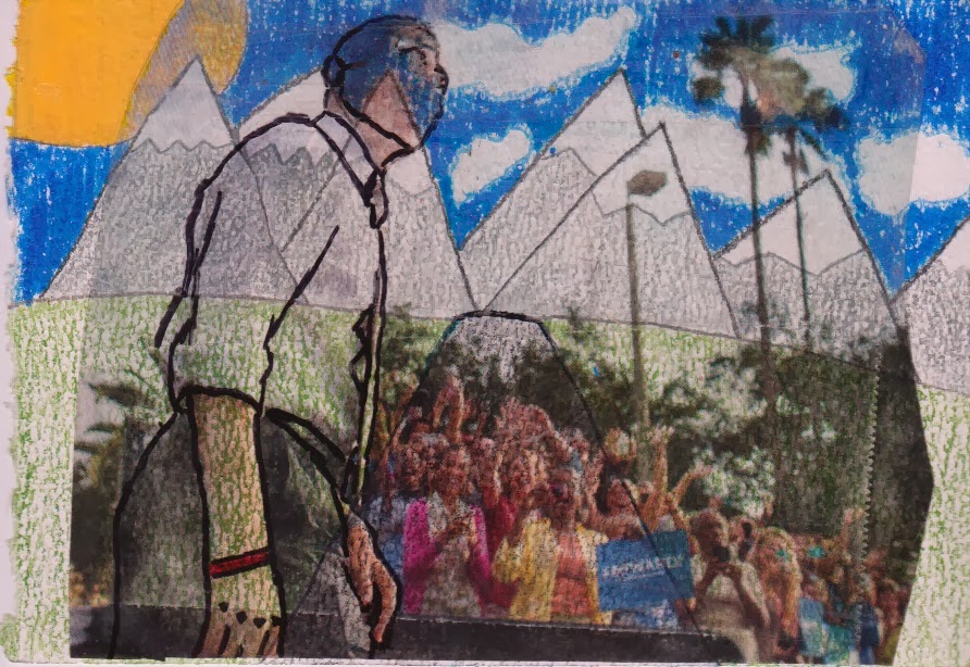
Postcard Art - William Hale - The Peaceful Path
Tuesday, November 26, 2013
Postcard Art - SilvaCynthia Chi-City
Throughout the project I wasn't sure what I wanted, I just knew I wanted to involve Chicago. I painted the background red to represent both the violence and passion in Chicago. Many people think Chicago is full of violence, which it is, but there's a lot of passionate people here as well. That's why I included the words in "tagging letter" to represent how these letters are connected both to the tagging crew and gangs here in Chicago; but also many people around the city use this type of art to express themselves and art. There's a black slash in the card to split the city almost, the smaller side is darker which represents the violence in Chicago and the bigger brighter side to represent the passion good and hope in Chicago still. I put Chi-city instead of Chicago because to think it represents it better and myself.

Subscribe to:
Posts (Atom)